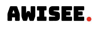

Instagram has shifted from passive browsing to rapid evaluation. Users decide whether to engage with a profile almost instantly. Instagram highlight cover design plays a subtle but powerful role in that decision. Highlights appear directly below the bio, placing them in a prime visual location. Because Highlights are permanent, they shape how new visitors understand a profile. Many accounts underestimate this impact and use inconsistent or unclear covers.
Over time, these small design choices reduce engagement. AWISEE noted that Instagram has become a full-scale marketing engine — one that connects brands, drives purchases, builds communities, and sparks global trends. This article looks at Instagram highlight cover design through the lens of structure and behavior. It explains how users visually scan Highlights and why certain layouts perform better. It also explores the relationship between Highlight covers and Instagram profile optimization. Instead of focusing on decorative trends, the article emphasizes clarity and usability.
Turn Creator Content Into Measurable Growth
AWISEE helps brands partner with creators who understand pacing, hooks, Live structure, and product storytelling—turning Instagram engagement into consistent clicks and downstream conversions.
Design Tip #1: Keep Instagram Highlight Cover Design Visually Simple
Instagram Highlight covers are small. Very small. Hootsuite explains that because Highlight covers appear in a limited circular format, designs work best when they are simple and uncluttered. Effective Instagram highlight cover design usually follows one rule:
- One idea per cover
Good Practice
- Single icon or image
- Clear contrast
- Minimal elements
Poor Practice
- Multiple icons
- Text-heavy designs
- Overly detailed visuals
Simple does not mean boring. It means readable.
Design Tip #2: Maintain Consistent Instagram Highlights Branding
Consistency makes profiles easier to understand. TheMarketingHeaven explains that visual consistency across Highlight covers helps build brand recognition and professionalism. It also states that 98% of fashion brands benefit from cohesive visual branding.
Instagram Highlights branding benefits from:
- Consistent icon style
- Repeated color usage
- Similar spacing and layout
Consistency does not require identical covers. It requires visual connection.
Design Tip #3: Use Brand Colors Strategically in Instagram Highlights Covers (2026)
Color is a fast recognition cue. Use brand-aligned colors in Instagram Highlights covers to:
- Improve visual appeal
- Maintain cohesive aesthetics
- Strengthen brand identity
Strategic color use means:
- Choosing one dominant brand color
- Supporting it with neutral tones
- Maintaining contrast for clarity
This strengthens Instagram Highlights layout and readability.
Design Tip #4: Use Icons or Symbols That Communicate Instantly
Highlight covers are viewed mostly on mobile devices, where space is limited. Because of this, icons often work better than detailed images. Icons help because they:
- Reduce the need for text
- Communicate meaning quickly
- Improve usability
This makes icon-based Instagram highlight cover design especially effective.
Practical Instagram Highlight Cover Ideas
Common, easy-to-understand icons include:
- Shopping bag → Products
- Question mark → FAQs
- Star → Reviews
- Play button → Tutorials
These Instagram highlight cover ideas work because they reduce uncertainty.
Design Tip #5: Align Instagram Highlights Layout With Content Categories
Highlights work best when content is organized.
EmbedSocial explains that Instagram Highlights allow users to group Stories into categorized sections, making content easier to discover. A clear Instagram Highlights layout often includes:
- Products or services
- Tutorials or education
- Reviews or social proof
- Behind-the-scenes content
Structure improves navigation. Navigation improves clicks.
Design Tip #6: Highlight What Actually Matters
We warn you against highlighting too much content. When too many Highlights exist:
- Important content gets buried
- Navigation becomes harder
- Engagement suffers
We recommend regularly updating Highlights and prioritizing valuable, evergreen content. This is a core principle of Instagram Highlights strategy.
Design Tip #7: Showcase Products, Services, or Proof
Hootsuite shows that many brands use Highlights to surface:
- Product guides
- Services
- Launches
- Important information
This turns Instagram highlight cover design into a soft conversion tool.
Design Tip #8: Test and Refresh Instagram Highlight Cover Design
Highlight covers can be edited or replaced at any time. There is no penalty for changing them. This makes Highlights ideal for experimentation:
- New icons
- Updated colors
- Revised categories
Refreshing covers helps keep profiles aligned with current messaging.
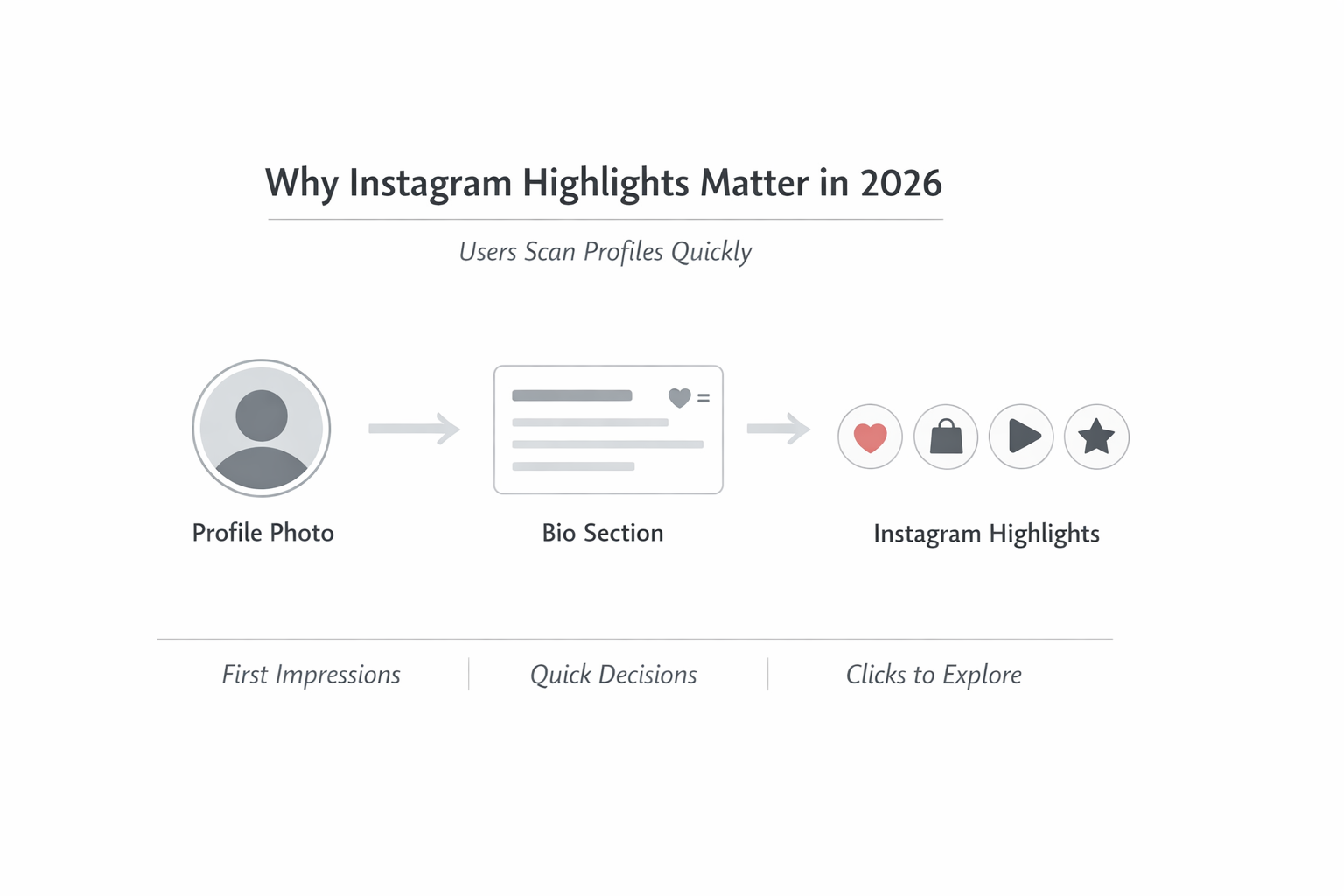
What Are Instagram Highlights Covers — And Why Clicks Start Here
Instagram Highlights are saved collections of Instagram Stories. They appear as circular icons under the bio. Each Highlight consists of:
- A title
- A cover image
The cover image is the first visual signal.
Instagram Highlights allow users to keep Stories visible on their profile for as long as they want, instead of letting them disappear after 24 hours.
This permanence is what gives Instagram Highlights covers their importance. They turn temporary Stories into long-term profile content.
A clear Instagram highlight cover design helps users understand:
- What content exists
- How it is organized
- What to click first
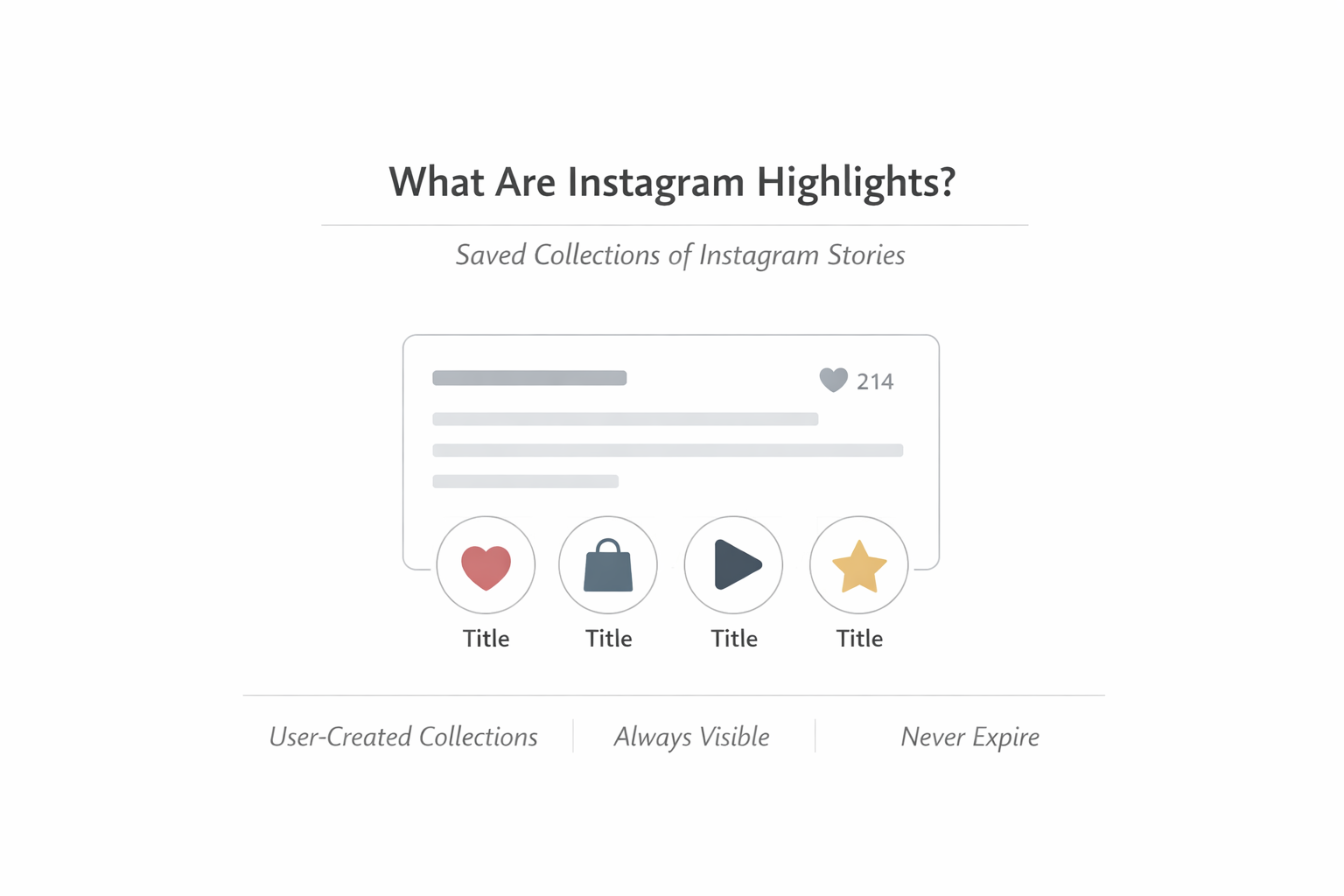
How Instagram Users Visually Scan Highlights
Users do not start by reading Highlight titles. They scan visually.
The scan behavior is simple:
- Left to right
- Fast
- Visual-first
If Instagram Highlights covers look inconsistent or confusing, users skip them. If they look clear and familiar, users tap.
This is not about trends. It is about usability.
How Instagram Highlights Fit Into Instagram Profile Optimization (2026)
Instagram Highlights sit in a fixed position:
- Below the bio
- Above the grid
That placement makes them part of the profile’s structure.
Highlights help:
- Make past Stories accessible to new followers
- Organize Stories into categories
- Present long-lasting content libraries
This is why Instagram Highlights strategy matters. Highlights are not decorative folders. They are navigation tools.
Instagram’s Testing of a Dedicated Highlights Tab
Instagram has discussed testing a separate Highlights tab next to the grid. If this becomes permanent:
- Instagram Highlights covers become more visible
- Instagram Highlights layout becomes more important
- Visual consistency becomes more noticeable
This makes Instagram highlight cover design a long-term decision, not a cosmetic tweak.
Measuring Instagram Highlights Strategy Performance
While Instagram does not provide direct CTR data for Highlights, users can still monitor:
- Highlight views
- Story interactions
- Engagement behavior
Behavioral signals reveal what content resonates.
Common Instagram Highlight Cover Design Mistakes
Common mistakes include:
- Overdesigned covers
- Inconsistent branding
- Poor contrast
- Too many Highlights
- Outdated content
These reduce clarity and clicks over time.
Instagram highlight cover design is not decoration. It is structure. Instagram Highlights covers influence:
- Navigation
- Understanding
- Engagement
In 2026, profiles that perform well are not louder. They are clearer.
Small design decisions compound. And Instagram Highlights covers are one of the easiest places to improve clicks when designed correctly.
Align Creators, Audience, and Grow Your Brand with AWISEE
AWISEE aligns creator selection, audience targeting, and content structure to ensure clicks come from the right users—not wasted impressions.